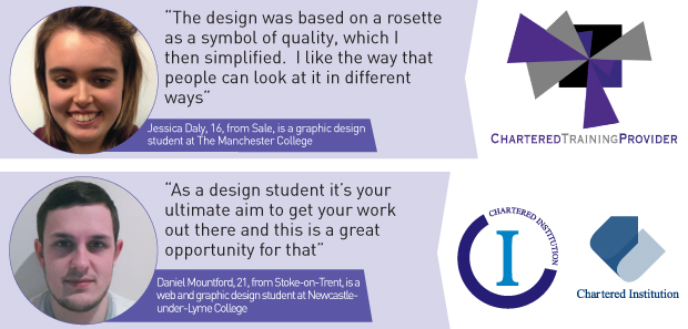
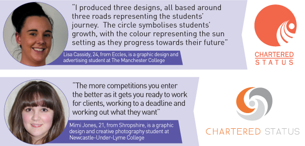
Five students have had their “eye-catching” logo designs shortlisted in a competition to find the best seal of approval for providers.
The Department of Business, Innovation and Skills (BIS) launched a contest for FE students to produce a graphic mark that best reflected “chartered status”, a concept being developed by the government that would recognise top FE providers.
FE Minister Matthew Hancock will pick a winner from six designs created by Paayal Makdani, Jess Daly, Lisa Cassidy, Mimi Jones and Daniel Mountford, who had two entries selected.
“I couldn’t believe it and was shocked and surprised to be shortlisted, especially as it was a national competition,” said graphic design student Daniel, 21 and from Newcastle-under-Lyme College.
“Obviously as a design student it’s your ultimate aim to get your work out there and this is a great opportunity for that.”
Daniel told FE Week he developed his blueprints over the course of a week and his favourite of the two was his turning arrow logo as he believed it best answered the brief which specified entries should reflect the theme of “moving forward”.
Attracting around 130 entries, the competition was shortlisted by a judging panel made up of Susan Pember, director of FE and skills Investment at BIS, Joy Mercer, Association of Colleges policy director, Gemma Painter, NUS head of FE, Andy Gannon, 157 Group director of policy, PR and research, and Stephen Ram Kissun, marketing and membership manager of the Association of Employment and Learning Providers.
Having students involved is important and could be powerful”
Mr Gannon said: “The logo needs to be clear and easy to recognise, while reflecting achievement and positive forward movement.
“It was hard to choose between the many designs submitted, but any of the shortlisted ones has the potential to represent something good for colleges and providers to be proud of.”
The winning designer picks up an iPad and the chance their emblem could represent the chartered status brand.
Chris Thompson, deputy director for performance management at BIS, said: “We were absolutely delighted with the response.
“Students will be the main customers for the chartered status so we wanted something they could identify with — having them involved is important and could be powerful.
“We wanted something eye-catching that represented the idea of movement and were pleased with how well the students took this on-board.”
Mr Hancock said the chartered status mark of quality was being developed as a “beacon to motivate improvement” and to “publicly mark success” so people knew a college was “excellent”.
In documents about the development of the scheme BIS said the FE sector would “take ownership” of the chartered status process after around three years.
Providers would apply for chartered status and if they met certain criteria such as showing strong leadership and management and having excellent feedback from learners as well a programme of community activity endorsed by Local Enterprise Partnerships, they could use the term in reference to their title.
BIS put out a consultation on the chartered status concept attracting 50 responses described by Mr Thompson as “constructive and positive”.
All of the shortlisted entries have a lot of potential but, for me, the clear leader is Daniel Mountford’s turning arrow concept.
This logo best meets the requirements of the brief for a forward–moving and instantly recognisable design.
Arrows usually represent movement forwards and upwards, evoking aspiration — perfect for a logo used to distinguish training providers with chartered status from those without.
The transparency used in the logo gives it a dynamic feel and a sense of depth, creating an eye-catching brand. The simple, one–colour design makes the logo versatile and functional. This kind of brand will be used in a variety of applications and Daniel, has clearly taken this into consideration when planning the design.
That’s not to say the concept is perfect. One criticism is that the typography that sits alongside the mark could use a little care and attention, perhaps taking cues from Lisa Cassidy and Mimi Jones. Both their designs use friendlier fonts with a little more character.
Although colours are easy to change and are usually left until last in a project like this, it would have been nice to see Daniel’s arrow concept in a few other colour options — something a little lighter and brighter perhaps, especially in a sector with a bit too much blue and grey.
For young designers it’s impressive just to get this far so well done to all the shortlisted contestants and may the best brand win.
On top of an iPad, the competition winner will spend a day (fully paid) working with Dan Duke at theFE Week offices.


Your thoughts